UX Designer & Artist

Making Fun Accessible

Welcome! Feel free to explore my page and view some of my work.

Portfolio

UX Gallery

Flip through the cards with the arrows, or pick a card to bring it to the front.

Portrait of Victoria Ludwig smiling outdoors, with long wavy auburn hair and a denim top

About me

UX Designer and Artist

    Back to portfolio

    Case study · UXDG 101

    Flora & Fauna: Reimagined

    F&F: Reimagined was a team project created in my UXDG 101 class. It was a learning process and my first real experience with user experience design.

    Overview

    Neighborhood bakery, coffee house, and supper club.

    An outdated website can make a great cafe hard to find and harder to love. Flora & Fauna: Reimagined breathes new life into a beloved local Savannah cafe in a visually appealing, user-friendly way. Shaped by grounded user research and thoughtful design, the redesign makes the cafe experience effortless for its customers.

    My role
    Interaction Designer
    Course
    UXDG 101, User Experience Design Methods
    Team
    Evelyn Swanson, Evie Wang, Tori Ludwig, Amy Sim, Evie Herb
    Methods
    Observational study, card sorting, wireframing, prototyping

    The problem

    When visiting the Flora & Fauna website, customers could easily get confused while trying to navigate it. The site lacked information, its text was hard to read, and its navigation buttons were misleading. That experience could deter new patrons from visiting, costing the cafe business in the long run.

    Our solution

    We streamlined the site around what customers want to know: reservations, menus, the Flora & Fauna story, and online ordering, each named clearly. Anyone left with questions can reach the cafe through an organized footer. The result makes regulars feel appreciated and opens the doors to new faces.

    Discover

    Research

    We conducted a “fly on the wall” observational study at Flora & Fauna to learn about the customer base, the overall aesthetic, and the company’s values.

    1. 1Group of 3
      Sunday, January 18
      11:30–2:00
    2. 2Group of 3
      Sunday, January 25
      12:00–2:00
    3. 3Group of 2
      Monday, January 26
      12:00–2:00

    Research logistics

    We sat at a good vantage point to observe the atmosphere of the cafe, as well as customer and employee interactions, on different days.

    We chose three guiding questions so we could stay focused on our goal throughout the discover and develop phases.

    Questions we focused on

    1. How might we better cater to the demographic and needs of our users?
    2. How might we identify specific elements that Flora & Fauna is lacking compared to other restaurants and cafes?
    3. How might we better reflect the mission and values of Flora & Fauna?

    From our primary and secondary research, we pulled out the core findings that would guide the next phases of the project.

    Core findings

    Friendly & welcoming

    • Staff and customer interactions
    • Relaxed atmosphere
    • Slow paced

    Visual brand

    • Consistent aesthetic
    • Color palette

    Sophisticated & sustainable

    • Interior design
    • High-end menu items
    • Reusable products

    Customer base

    • Tourists
    • Locals
    • All ages

    We sorted out which parts of the original site were working, and which could be a source of frustration for users.

    Working
    • Well-received aesthetic
    • In-person experience
    • Color palette
    • Product photos
    Pain points
    • Disorganized
    • Random or unnecessary links
    • Lack of information
    • Brand representation

    Develop

    Early design process

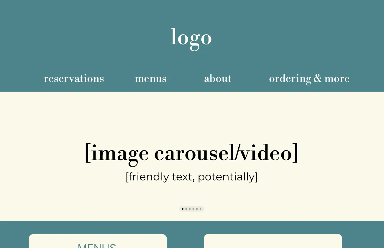
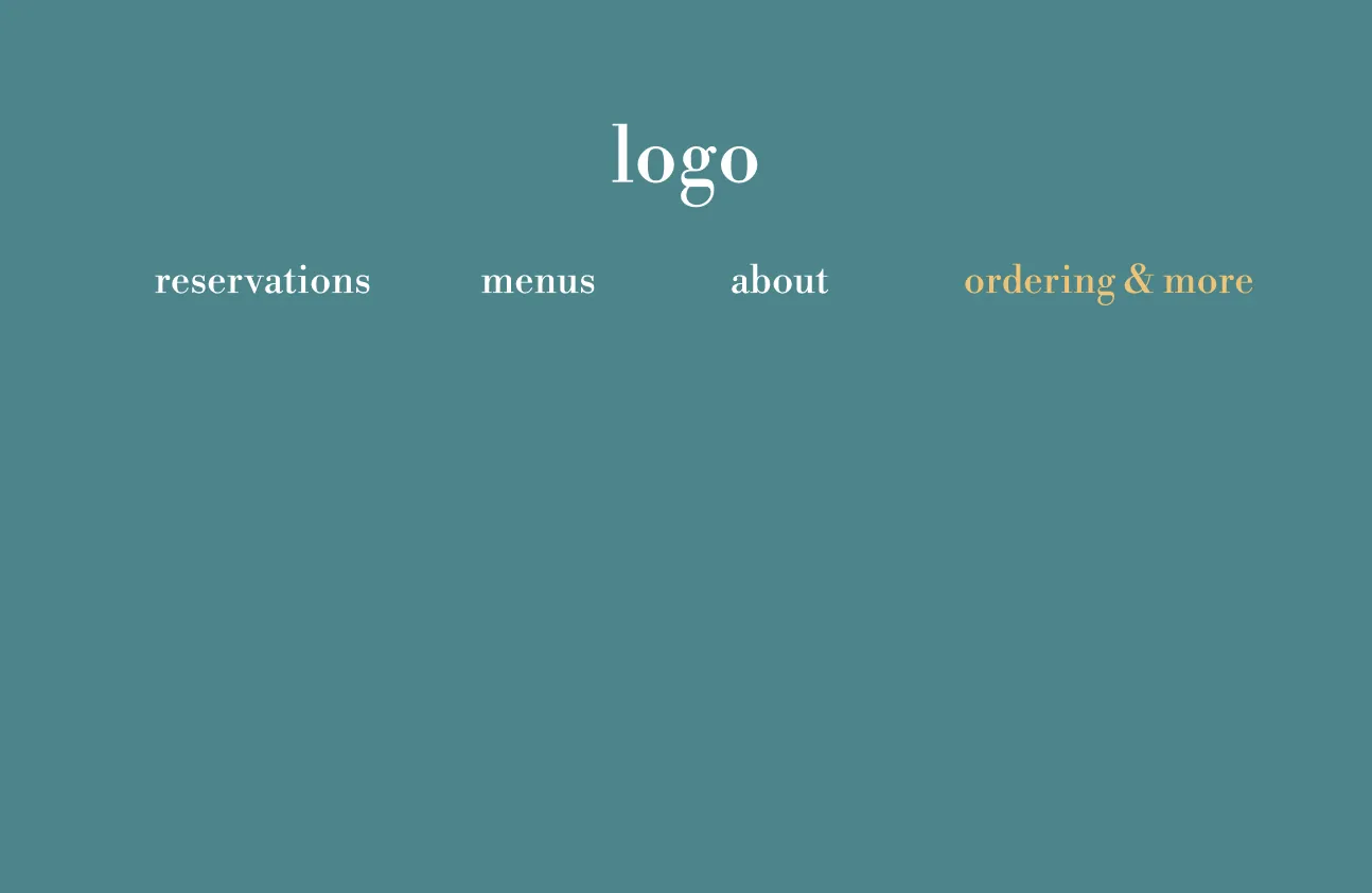
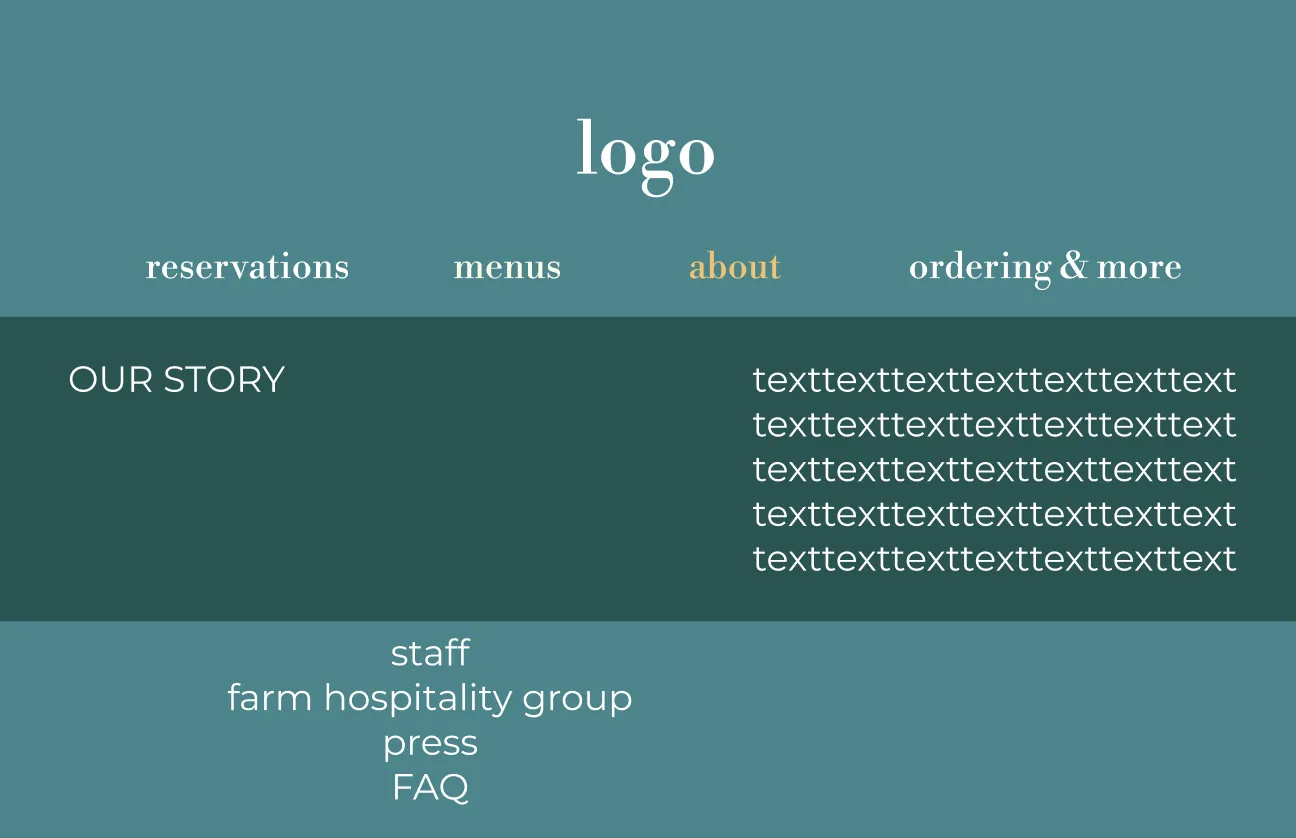
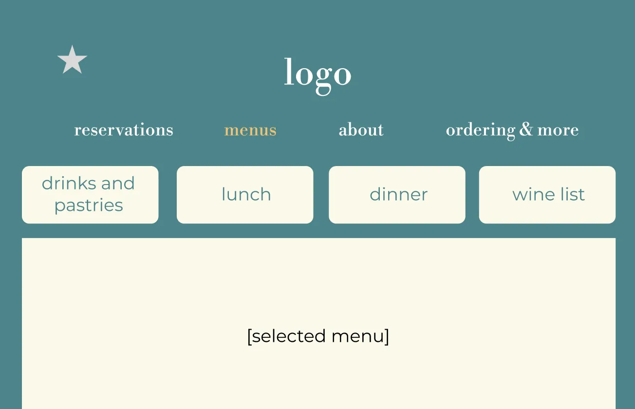
    Low-fidelity wireframes

    Low-fidelity homepage wireframe: logo, navigation, and an image carousel with friendly text.
    Homepage
    Low-fidelity navigation wireframe with reservations, menus, about, and ordering and more.
    Navigation
    Low-fidelity about page wireframe with an Our Story block and links to staff, farm hospitality group, press, and FAQ.
    About page
    Low-fidelity menu page wireframe with tabs for drinks and pastries, lunch, dinner, and wine list.
    Menu page

    Homepage iterations

    Wireframe
    First visual pass
    Second visual pass

    Deliver

    Final design decisions

    Look through the final decisions we made to see how we curated our redesign and built Flora & Fauna: Reimagined.

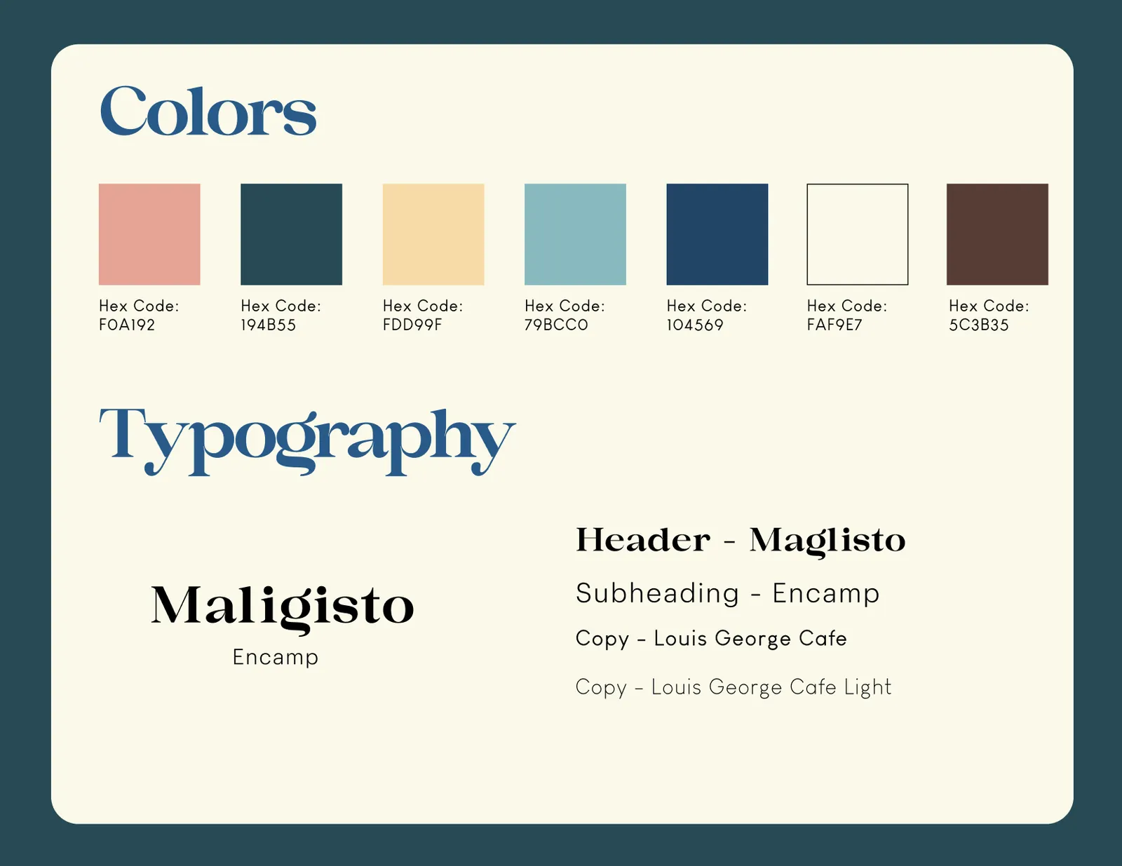
    Colors and typography board: seven brand colors with hex codes, and Magilsto, Encamp, and Louis George Cafe typefaces.
    Colors & typography
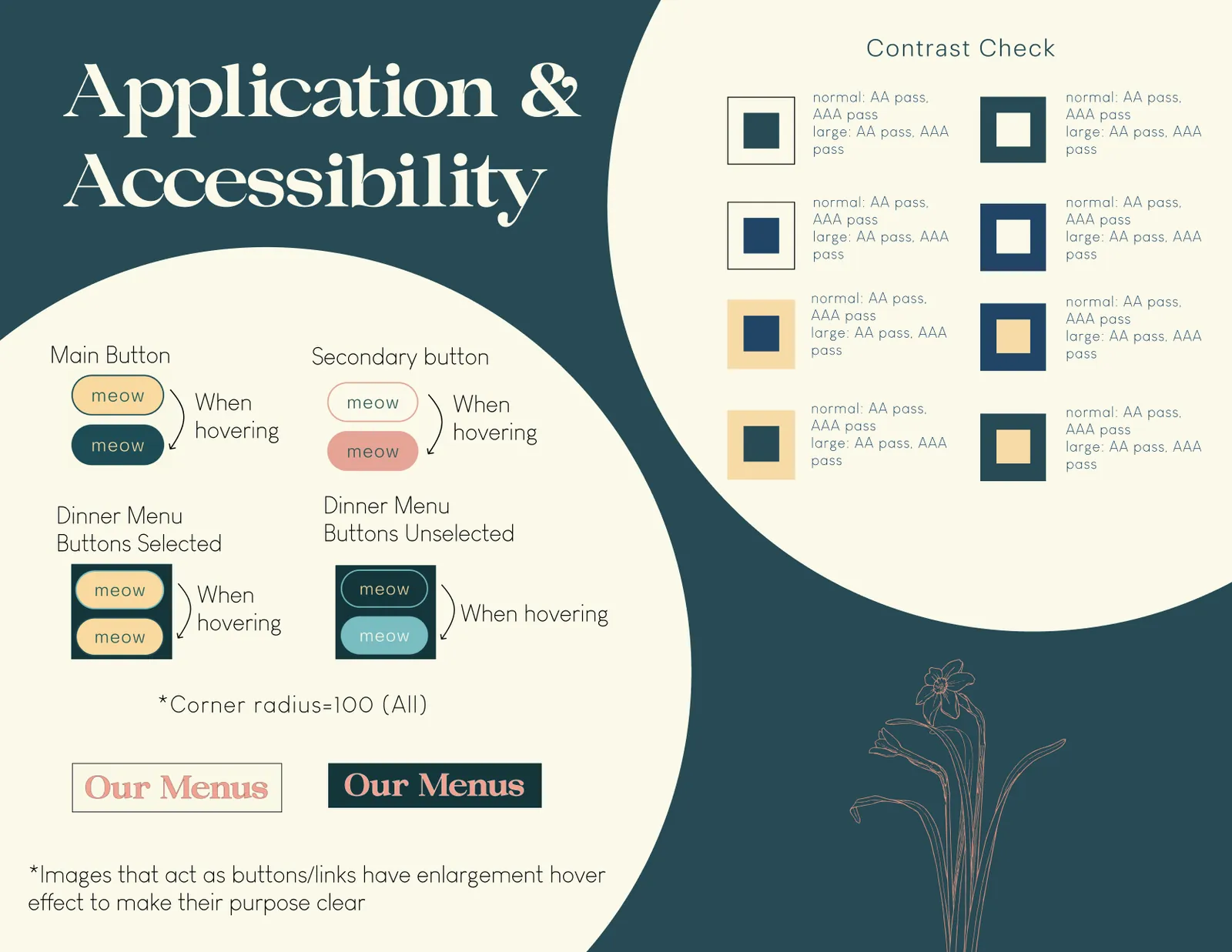
    Application and accessibility board showing main and secondary button hover states, dinner menu button states, and color contrast checks that pass AA and AAA.
    Application & accessibility
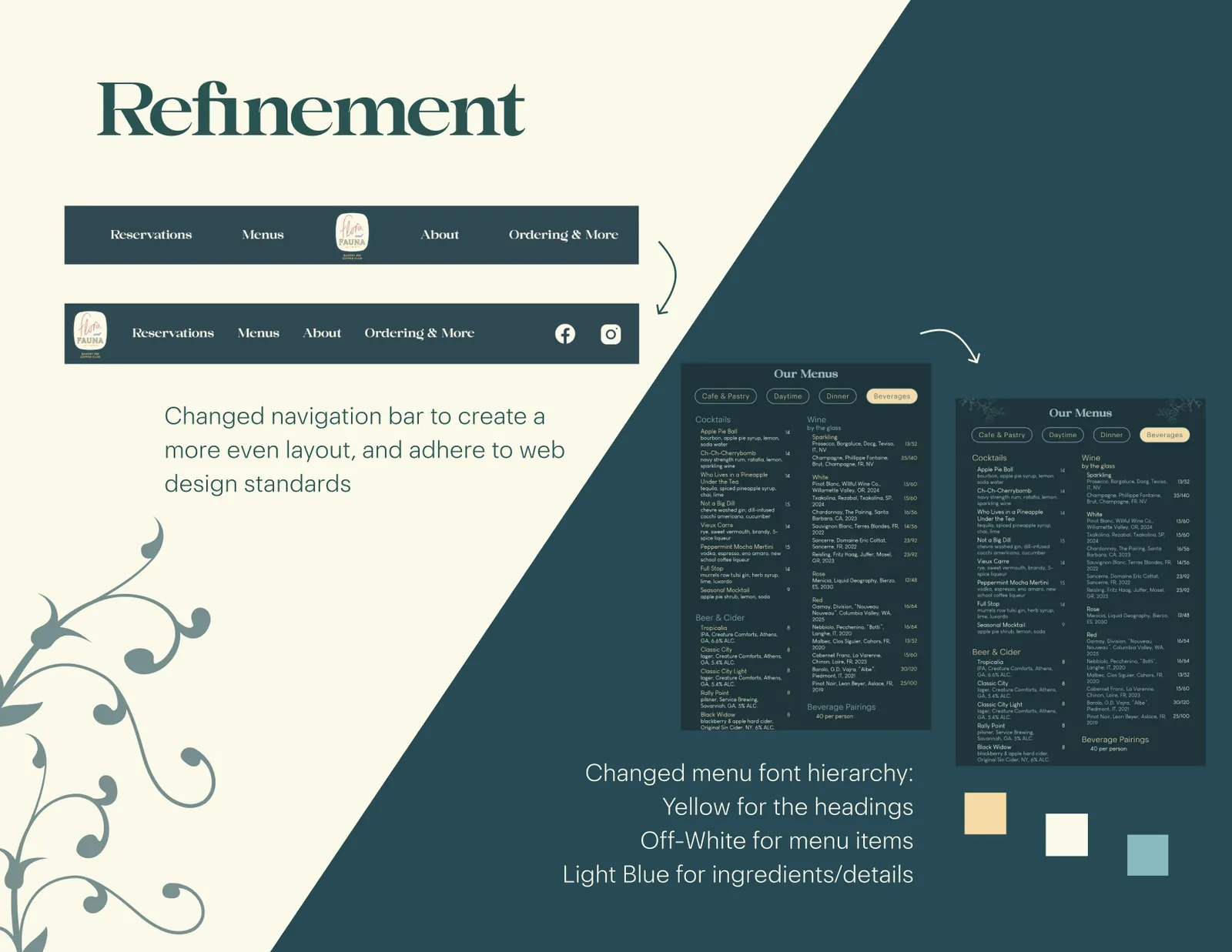
    Refinement board: the navigation bar changed to an even layout, and the menu font hierarchy changed to yellow headings, off-white items, and light blue details.
    Refinement
    • Increased accessibility

      We tested the cafe’s iconic palette against WCAG standards and tweaked hues for readability, then added clear hover feedback so buttons and photos show they can be selected.

    • Restructured IA

      Using our research, mainly a card sorting exercise, we reorganized the navigation and renamed pages to reflect what they hold.

    • Clear navigation

      Clearer categories and fewer, more condensed pages reduce cognitive load, with some pages combined into one.

    • Personal touches

      Engaging media and personal stories about the Flora & Fauna family bring the homely feel of the cafe online.

    Results

    Outcomes & prototype

    Traceability

    Accessibility & user needs

    • Adjusted the color palette and typography hierarchy so the site is accessible to all users and follows WCAG standards
    • Clear, consistent menus

    Misleading navigation buttons

    • Content under the navigation drop-downs is aptly named and categorized

    Lack of information about company values

    • Added the story of how Flora & Fauna started, with dedicated pages for About information

    Outcomes

    Increased accessibility

    • A newly adjusted color palette and typography hierarchy
    • Follows WCAG standards
    • Customers can find context about Flora & Fauna’s values
    • Nobody has to make assumptions or feel excluded and confused

    Reduced cognitive load

    • The original navigation was not intuitive
    • Drop-down content is aptly named and categorized, reducing cognitive load for all users
    • Clear, consistent menus are essential
    • Menus are separated by time of day and type of food or drink, with an emphasis on cafe service versus dinner service

    Impact

    Flora & Fauna: Reimagined has a clear impact. With its increased accessibility, clarity, and detail, the site gives every visitor a consistent, sincere experience that reflects the cafe itself. It aims to meet the needs of current and future customers and set a higher standard for competitors.

    Interactive prototype

    The clickable Figma prototype will be linked here soon.

    Back to portfolio
    Back to portfolio

    Project · Figma Make

    PassioGo Redesign with Figma Make

    Location
    Savannah, GA
    Role
    UX Designer
    Software
    Figma Make

    This piece was an experiment with Figma Make when it first came out. I made a prototype for a revised PassioGo app, the shuttle tracker SCAD students use, using insights and pain points from the current app to improve it.

    The problem

    Pain points in the current app

    • Inaccurate timing

      Bus arrival times on the routes weren’t reliable.

    • Hard to find stops

      It was difficult to see which routes serve a specific stop.

    • Hard to plan trips

      It was difficult to work out which routes to take to get where you want to go.

    Reflection

    Lessons from vibe coding

    What I learned

    • Giving the tool information up front, before any coding starts, is valuable and saves time.
    • Specific language is needed to get certain objectives implemented.
    • Figma Make and vibe coding can do a lot, but they struggle with very specific, nuanced goals, like drawing the routes on the map.

    What I’d improve next time

    • Provide even more information up front.
    • Learn more coding techniques so I can make changes myself without typing a prompt.
    • Put more information into a single prompt to speed up the process.
    Back to portfolio

    Industrial Design

    Cat Desk Organizers

    Role
    Industrial Designer
    Software
    Rhino 8, KeyShot

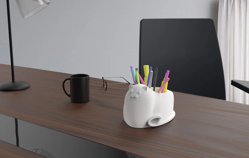
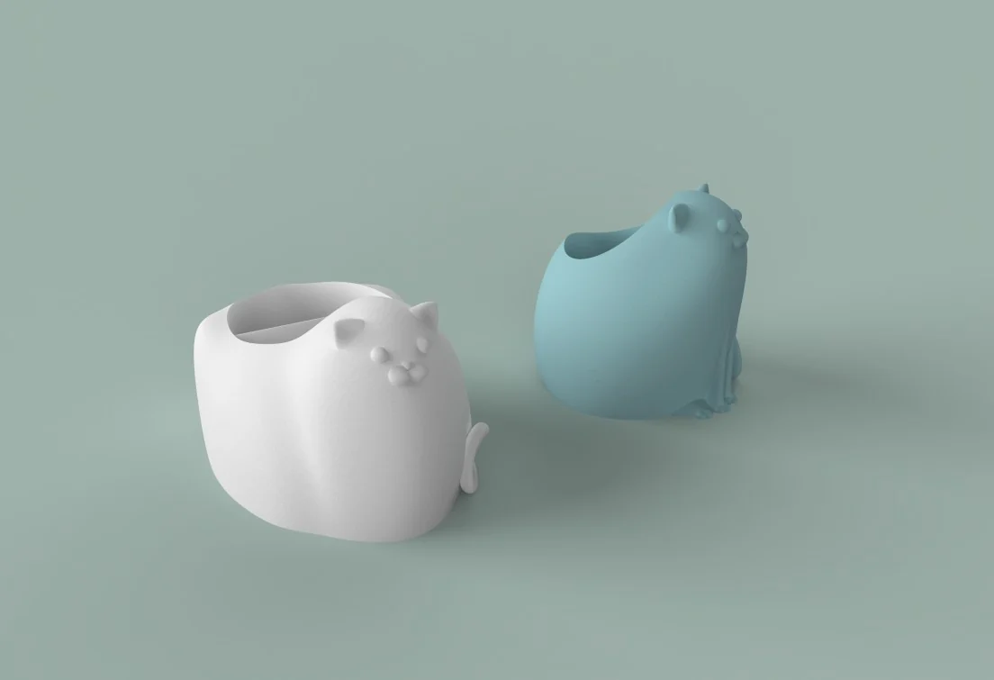
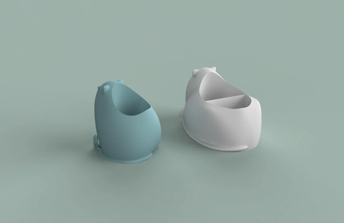
    This project took a product from idea to finished renders. I designed and modeled a pair of cat-shaped desk organizers in Rhino 8, then used KeyShot to explore different rendering techniques, from clean studio shots to staged scenes that show the organizers in use on a desk.

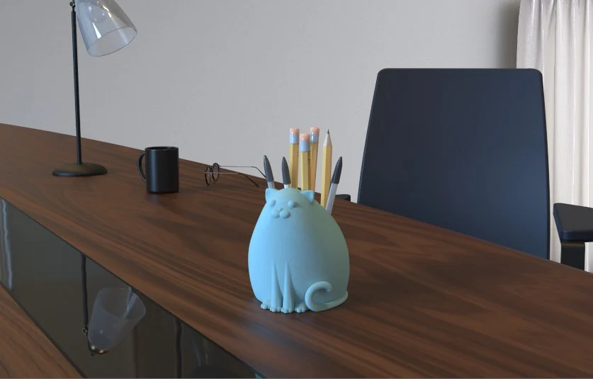
    The blue sitting cat organizer holding pencils and pens on a wooden desk.
    Sitting cat organizer
    The white lounging cat organizer holding colorful markers on a wooden desk.
    Lounging cat organizer
    Studio render of the white and blue cat organizers from the front on a sage background.
    Studio render, front
    Studio render from behind, showing the open tops and the divider inside the white cat.
    Studio render, back
    Back to portfolio

    Industrial Design

    Cat Faucet

    Role
    Industrial Designer
    Software
    Rhino 8, KeyShot

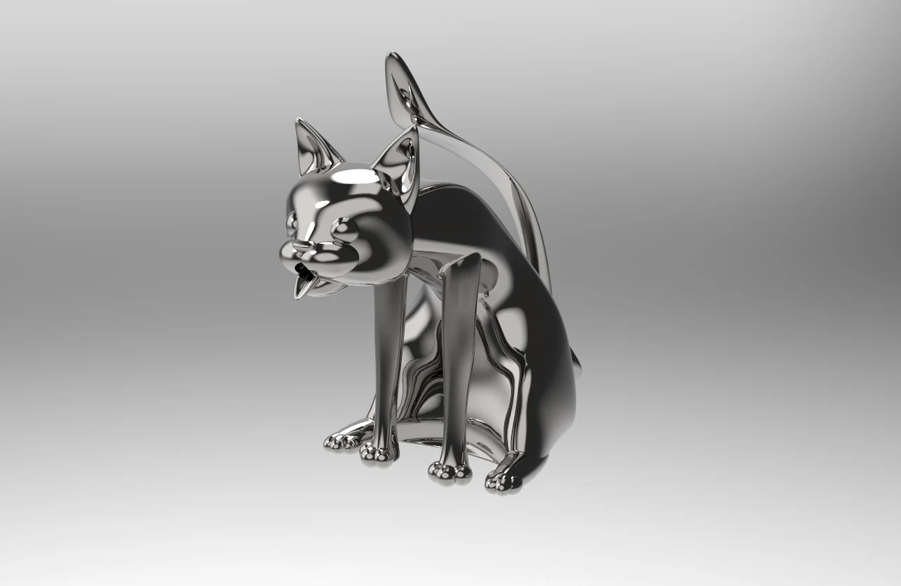
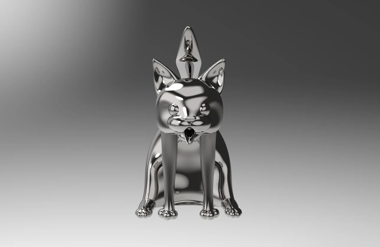
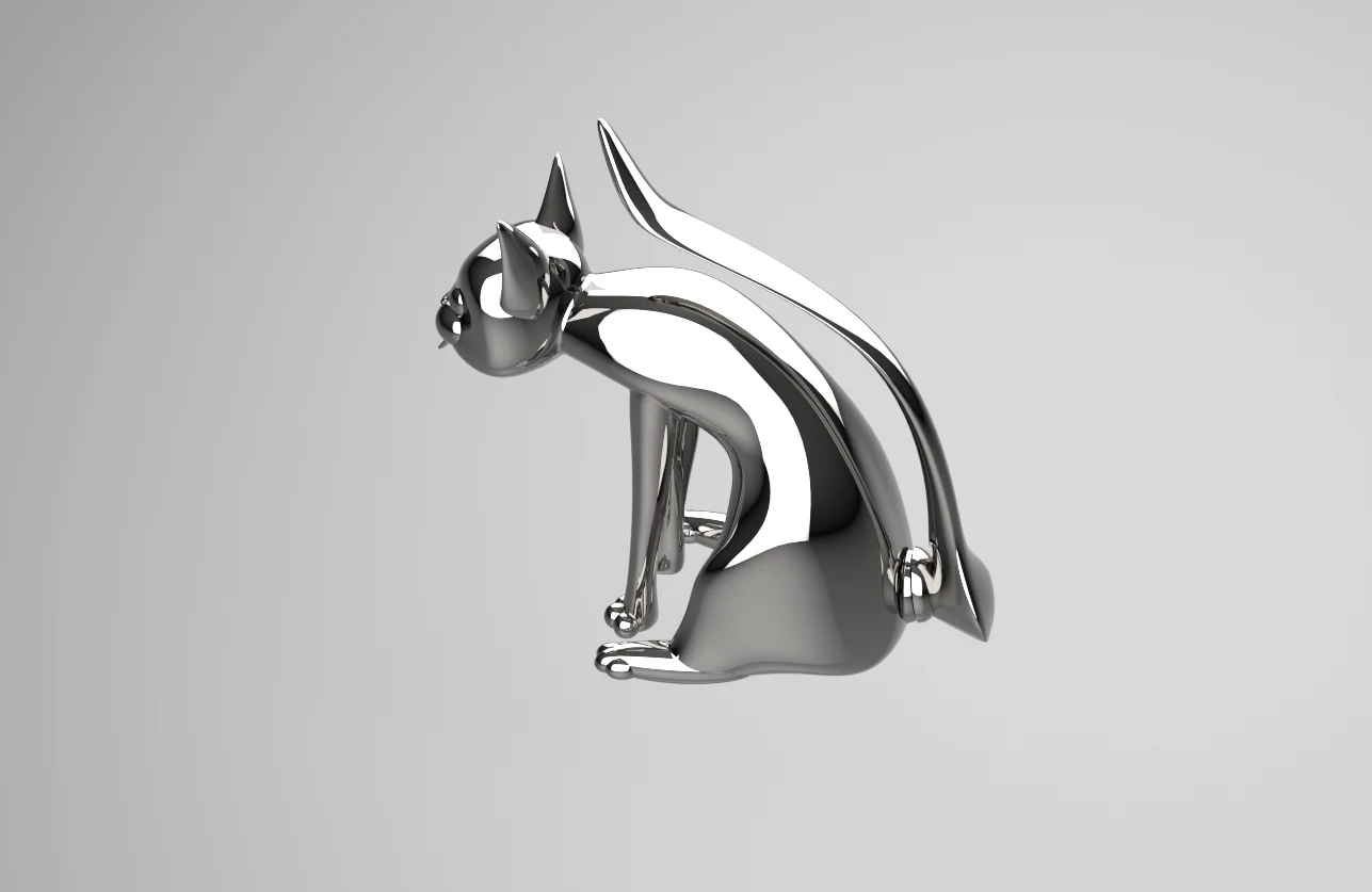
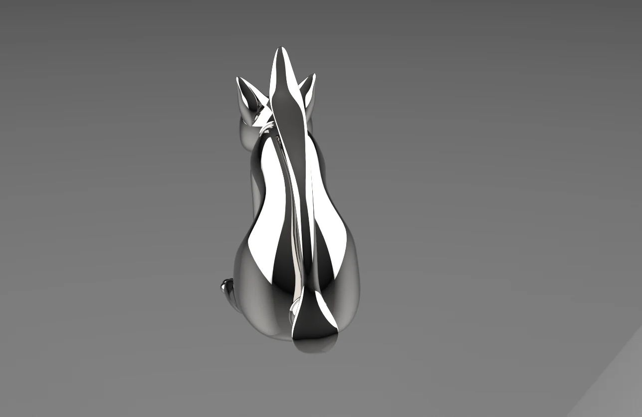
    A playful take on an everyday fixture that combines form with function. This bathroom faucet is shaped like a cat leaning over the edge of the sink, with water pouring from its mouth, and its arched tail rises behind it. I modeled it in Rhino 8 and rendered it in KeyShot, using a polished chrome finish so every curve catches the light.

    Faucet and sink
    Close-up from the side

    Profile views

    Chrome cat faucet from a three-quarter angle, head lowered with its tongue out.
    Three-quarter view
    Chrome cat faucet from the front, showing its face, open mouth spout and four paws.
    Front view
    Chrome cat faucet in profile, leaning forward with its tail arching up behind it.
    Side view
    Chrome cat faucet from behind, with its tail running up the center of its back.
    Back view
    Back to portfolio

    Industrial Design

    Pepsi Tradeshow Booth

    Role
    Industrial Designer
    Software
    Rhino 8, KeyShot

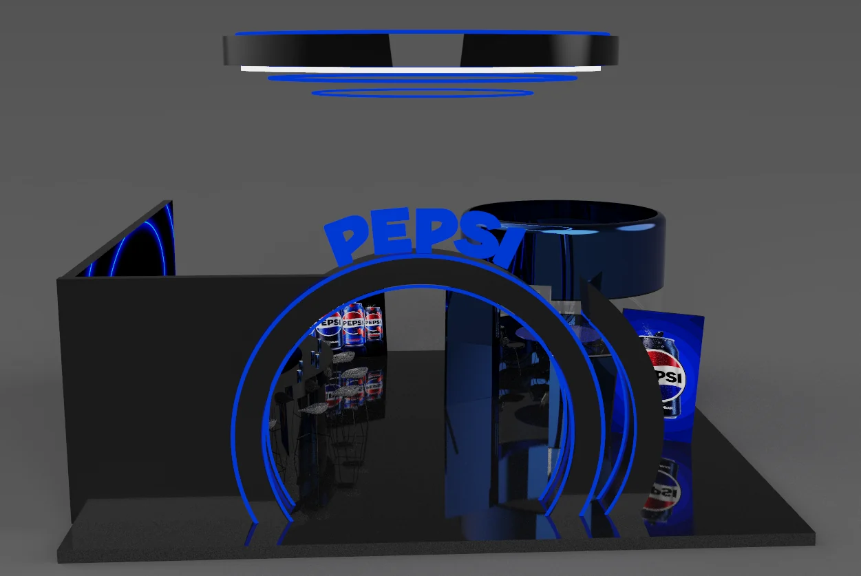
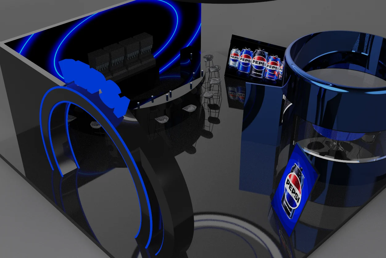
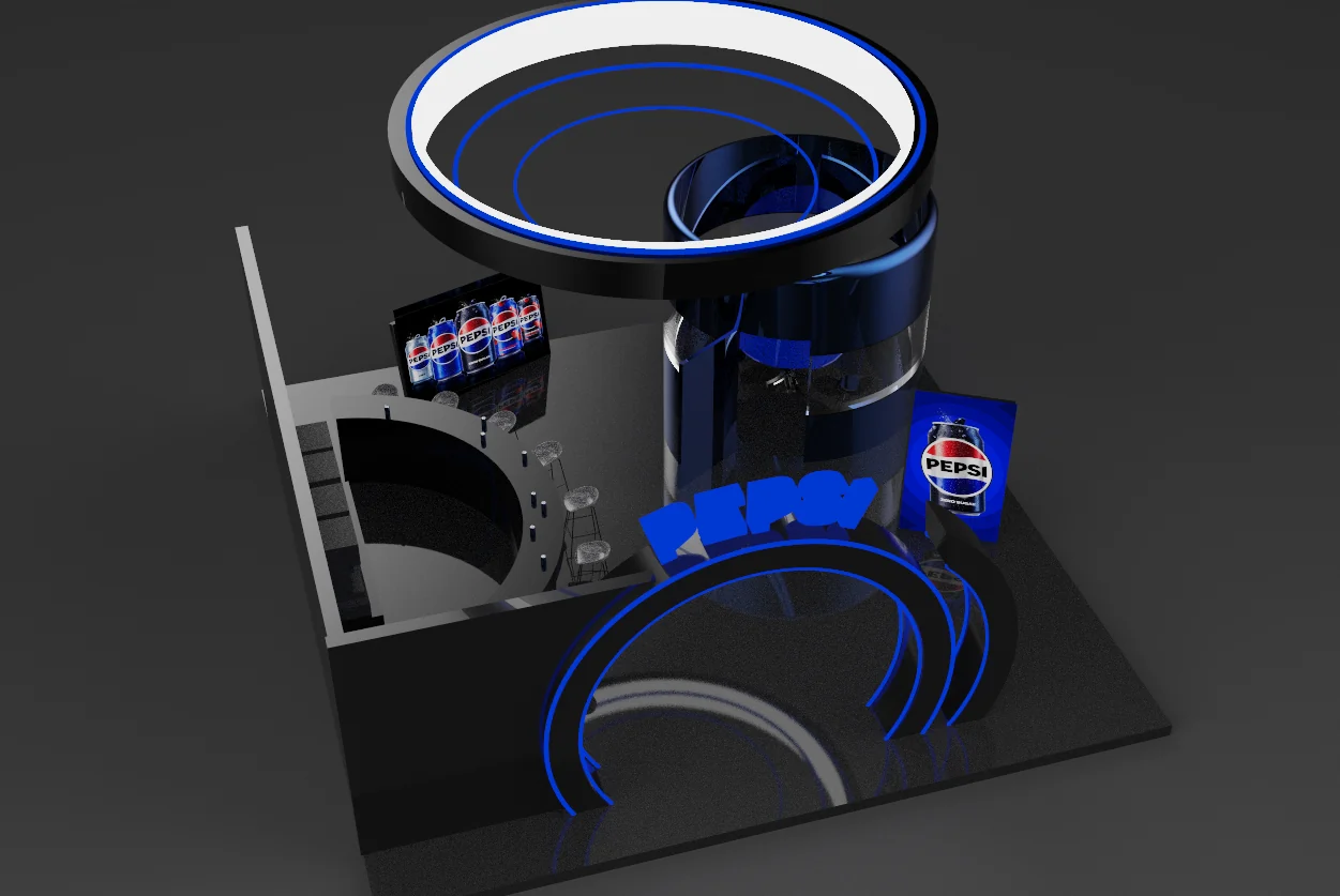
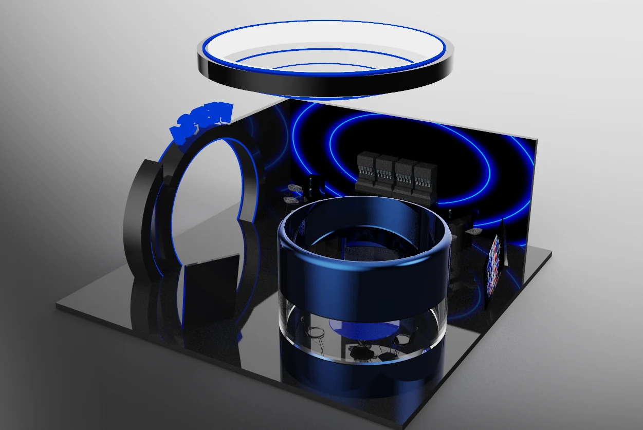
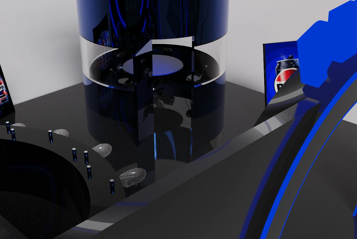
    A theoretical tradeshow booth designed for Pepsi to launch its new look. The design focuses on the circular elements of the Pepsi brand, its blue and black color palette, and a metallic, modern style, from the arched entrance and suspended light ring to the cylindrical glass lounge.

    Front view of the booth: a glowing blue arch topped with the Pepsi logo, with a suspended ring above.
    Front entrance
    Overhead view of the black bar with stools, a Pepsi can display and the glass-walled cylindrical lounge.
    Bar and lounge from above
    Top-down view of the booth showing the suspended light ring above the cylindrical lounge, the bar and the arched entrance.
    Top view
    The booth on a light background, focused on the glass-banded cylindrical lounge with the bar and blue ring wall behind.
    Cylindrical lounge
    Close-up of the glass band of the cylindrical lounge with seating inside, next to the bar and stools.
    Lounge close-up

    Contact

    Let's make something fun together

    Have a project, a role, or a question? I'd love to hear from you.

    Victoria laughing with her hand to her chin, sitting in a white skirt, tinted in teal